Net Zero Gradients
The following is taken from the post Net Zero Gradients.
On Tuesday of this week we learned that the ExxonMobil company has adopted Net Zero goals.
ExxonMobil aims to achieve net-zero emissions from its operated assets by 2050 and is taking a comprehensive approach centered on developing detailed emission-reduction roadmaps for major operated assets. This ambition applies to Scope 1 and Scope 2 greenhouse gas emissions.
This is welcome news — the company is joining many other oil majors who have declared similar goals. The statement does, however, leave two open questions. The first question is, “At what rate does the company plan to reduce emissions?” The second question is, “Why are Scope 3 emissions excluded?” We tackle the first of these questions in this post.
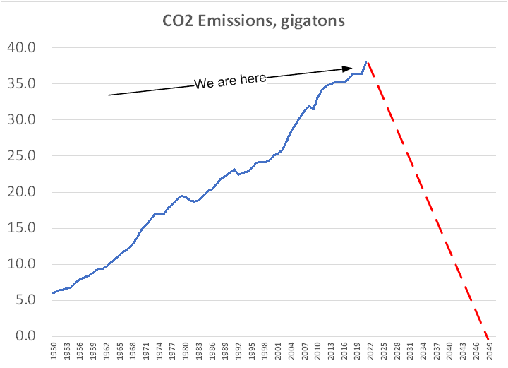
The sketch shows the rate at which human activities have been adding carbon dioxide (CO2) to the atmosphere. (Other greenhouse gases such as methane have been omitted from this analysis.)

We see that anthropogenic (human-caused) emissions have risen from about 6 gigatons (billion metric tons) in the year 1950 to close to 40 gigatons annually now. The rate of increase has been remarkably smooth. There are a few bumps and dips, but nothing of significance. In fact, it appears as if the line’s gradient has actually increased slightly in recent years.
The red dashed line shows the rate at which emissions will have to be reduced if we are to reach Net Zero by the year 2050. They have to decline at a rate almost three times greater than they increased over the course of the last seven decades. Given that CO2 emissions correlate closely with economic growth, following the red line would imply a massive reduction in economic activity.
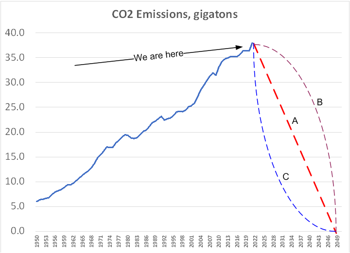
The next sketch shows three options for the rate at which emissions could decline.

Line A is the linear reduction that we have already seen. Line B assumes that the decline in the short-term is relatively modest, but then it speeds up. Line C represents the case where there is a very rapid decline in the early years, and a slow down as the year 2050 approaches. The area under each of these curves represents the total amount of CO2 added to the atmosphere. The differences between them are substantial. Scenario B adds something like 50% more CO2 to the atmosphere than A; Scenario C is correspondingly lower.
The ExxonMobil report projects a linear decline for different pathways.
The reality is that, for society as a whole, none of the three projections shown in the second sketch are likely to take place. In spite of all the statements of good intent from governments around d the world, there are few indications that the trajectory shown in the sketch (the blue line) is going to turn the corner any time soon, let alone start to decline.
In our next post to do with the ExxonMobil statement we will look at implications of limiting their target to just Scopes 1 and 2.
